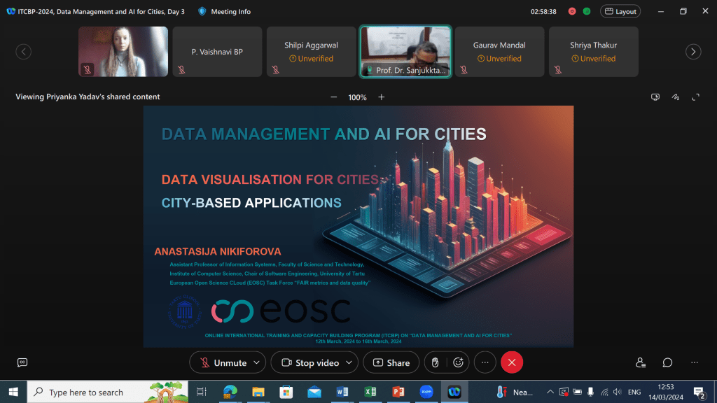
Yesterday, I had the honor of serving as an Expert speaker for an Online International Training and Capacity Building Program-2024 (ITCBP-2024) on “Data Management for AI Cities”, organised by the School of Planning and Architecture, New Delhi (SPA FIRST) that invited me to deliver a talk on “Data Visualisation for Cities: City Based Applications”.
During this talk, we touched on several important aspects surrounding data management and visualization in and for cities, including:
- Data management that was then deduced to data quality management of both internal and external data, departing from understanding these data to managing their quality throughout the DQM lifecycle (stressing that data cleaning is not the same as DQM), touching on several approaches to this with greater emphasis on the AI-augmented data quality management – existing tools, underlying methods, and weaknesses that should be considered when using (semi-)automatic data quality rule recognition, depending on the method they use for this purpose;
- Data governance was then discussed, stressing how it differs from DQM, and what it consists of and why it is crucial, incl. within the context of this talk;
- Data visualization & storytelling – role, key principles, common mistakes, best practices. As part of this, we covered strategies for selecting data visualization type with tips on how to simplify this process, incl. by referring to chart selectors, but also stressing why “thinking outside the menu” is critical, esp. within city-level data visualization (where your audience is often citizens or policymakers). We looked at the most common and/or successful uses of non-traditional types of visualizations, incl. tools to be used for these purposes, breaking them into those that require coding and those that are rather low- or no-code; noise reduction – simplicity – strategic accents’ use, as well as drill-down (aka roll-down) & roll-up use to convey the message you want to deliver while overcoming highlighting everything and thereby losing your audience. In addition, a UX perspective was discussed, including but not limited some aspects that are often overlooked when thinking about the design and aesthetic color palette, namely the color-blindness of the audience that might “consume” these visualizations and again, tips on how to use it easier – did you you known that there are 300 million color blind people? And that 98% of those with color blindness have red-green color blindness?
So what was the key message or a “takeaway” of this talk? In a very few words:
- Understand your data, audience and story you want to tell! Understand:
- your data,
- the story it tells,
- your target audience’s preferences and needs,
- the story you want to tell
- data suitability
- data quality
- Attention-grabbing visuals & storytelling is a key!
- reduce noise to avoid audience confusion and distraction
- use drill-down and roll-up operations to keep visualization simple
- add the context to provide all necessary information for clear understanding
- add highlights to focus their attention – add accents strategically
- Consider design – the optimal visualisation type, chart design, environment design, potential color-blindness of your audience
- Keep track of the current advances, but also challenges and risks, of data visualization in urban settings, incl. but not limited to (1) privacy concerns, (2) data silos, (3) technological limitations.


All in all, it was quite a rich conversation and I am very grateful to the organizers for the invitation to be part of this event and to the audience for the very positive feedback!

One thought on “Online International Training and Capacity Building Program-2024 (ITCBP-2024) for the School of Planning and Architecture, New Delhi and my talk on “Data Management for AI Cities””